Sept. 18, 2013
So you want a Patent?
Time and Money
First and foremost, figure out what kind of money and time you have.
- If time is on your side, and you don't have money, and you're curious about the patent process, do it yourself. All of it.
- If time is not on your side, and you have money, hire a patent attorney. They're not cheap. You're looking at $4,000 minimum.
- If time is not on your side, and you don't have money, then change your life so you can do either one of the above two options.
- If time is on your side, and you have a lot of money, pinch yourself…you're dreaming.
Important patent vocabulary to learn:
Provisional Patent
Non Provisional Patent
Utility Patent
Design Patent
Specification
Drawings
Oath/Declaration
Doing a patent yourself
It can be done. It's not impossible, and no, you don't have to be a patent attorney nor must you contract one. But…time MUST be on your side. Your patience will be tested. I estimate you can get away with obtaining a normal non-provisional patent for about $1500–$2000. Maybe a later patent will be less expensive after you learn and avoid the pitfalls.
Remember you will be dealing with the government rather than your business. You will be relying on others, not yourself. Generally speaking, the people you deal with as you submit your papers are not as passionate as you are. They may view you as a thorn in their side because you're a rookie, and not an attorney. Their job is not to show compassion or cheerlead you, and they'll roast you alive if you miss anything. They'll let you know that they're bothered by you, too. Be thick skinned, and acknowledge the fact that you are as green as a lima bean. Also, remember they are on and off the phone all day, which means long waits, crankiness, excessive rigidity, poor customer service, red tape everywhere, and mixed advice from people with the same job description working within the same department. Just because you'll be dealing with the USPTO, don't think they differ from the DMV.
Hiring someone to do the patent for you
I don't know, I've never done it. I should have done it, but alas, I didn't have the money for it. I was told by a patent attorney to expect paying at least $4,000 for a simple patent.
Two ways I suggest entrepreneurs do it:
One way
If you think you must get a patent to protect yourself, and it is high on your list of importance, then get a provisional patent (about $300 or less). Provisional Patents (PP)s require much less paperwork, and will cover you for a solid year where you can take your product to market, and test it/refine it/reproduce it…all with the name "Patent Pending." At that point, you should have a decent idea of what your non-provisional patent will be, and whether or not you ought to take it to market. Remember though, you only have a year, and at that point you must jump on to the Non Provisional filing, which is the real, more serious Patent filing. They'll let you know your time is ticking. At that point, you ought to know if you should hire an attorney, or do the patent yourself.
You can file a PP through LegalZoom.com, but I didn't particularly like their method. I felt I was repeating myself over and over again.
You can also do it yourself by studying the provisional patent documents on the USPTO website, or buying a NOLO book on Amazon.
I can almost guarantee that if you "think" you have your product right already, think again. As you test it, try it, etc…you'll discover flaws and try to refine them as you write your patent. A PP gives you temporary protection for 1 year, and also provides one extra year of coverage you would otherwise not have if you skipped the PP process and went strait to the NP process.
Another way
You can get hung up on your patent. It can distract you from your product, or from sales of your product. Focus on your product, see if it sells first. If it sells, and you know you've got a winner, keep selling it and cross your fingers there are no copycats. The worst thing that could happen is future competitors see you're making a killing, realize you don't have a patent, and then become a legit comptitor—but of course, they're in 2nd place. By that time, you'll have enough money to hire patent attorneys and will be able to add patented additions to your already successful product…just to one up your now obsolete competitor.
Sept. 3, 2013
How automation can benefit the creative industry
Whereas some creatives fear the power of computer programing, I believe automation, as represented in this Washington Post video, can liberate creatives.
It is my experience that talented creatives are often found doing busy work. Creatives can certainly be found among all industries, but for the sake of the example, I will focus on industries commonly identified as “creative industries” (writing, design-based industries, videography, music/sound, photography, etc.).
Production Labor
In the graphic design arena, this “busy work” has a label. It is known as “production” labor or “production” design. This sort of work is heavily left-brained, wherein it follows a tightly structured protocol to achieve a desired outcome. Students, recent graduates, or those with no particular initial skill, are often found among the ranks of production labor.
Creative Service
The opposite of production work would be creative work, wherein problems must be solved…from scratch. There are many methods on how to problem solve. I use one of these methods, which makes problem-solving more of a mechanical, left-brained process…but I find at the conclusion of each creative job, I drift heavily from the initial problem-solving method. If I was judged on how tightly I adhered to the aforementioned method, I would be labeled consistently insubordinate. Luckily, I am not judged on the process, but am judged on the outcome.
Two Hemispheres
Right-brained work often allows for set rules to be broken and set structures to be minimized or obliterated. Alternatively, left-brained work honors the existing system. It adheres strictly to tightly defined structures/protocols.
I have been working for several years with a good friend who happens to be heavily left-brained. He is a talented computer programmer and enjoys creating set structures and systems for a determined outcome. He once said it was very difficult to build programs that can stray from set structures and have a resulting product that is admirable to the masses. He finds my right brain as fascinating as I find his left brain.
I believe most left-brained work can be automated, allowing talented creatives to have more right-brained time—which is where they naturally excel. They could prioritize their time on jobs that are difficult to automate, and more abundantly access their springs of talent. In so doing, they could focus on jobs that have greater importance and produce better, more focused, work.
My allegorical point (a continuation of my opinion)
Due to the benefits of convenience, I believe the majority of consumers will settle for a McDonald's burger over a well-made burger.
Best Burger (Bountiful) has a sign that reads, “Please expect a 5 minute wait while we make your burger.” The sign's presence conveys Best Burger's mantra. They are:
1. Lazy
2. Slow for an undefined reason
3. More particular about the caliber of the burger, than the consequence of time
4. A combination of some/all of these
For the impatient, the alternative to Best Burger might be a one to two minute wait at McDonalds. Although the majority of burger eaters prefer well-made burgers, McDonald's is heavily focused on efficiency and customer convenience over quality. In so doing, they dominate the hamburger market.
Best Burger, however, seems to cast convenience aside and focus on quality.
Both restaurants are likely to desire more profit. Therefore, if the Best Burger franchise owner was approached by an automation tech who said, how about we create the convenient burger for you to sell to the majority, but allow you to keep selling your inconvenient Best Burger—would you do it? Many franchise owners would seriously consider the option, and some might say, “absolutely.”
…Is this the reason for the “Value Menu?”
Automation
Certainly automation is not the not desired or accepted by all. The Wall Street Journal, as shown within the video, is an example of a writing company that rejected the idea…but one they may have to embrace in the future.
There are some industries that would immediately benefit by embracing the automation concept. Most creative problems solvers dislike being “convenient tools in a shed.” I believe this type of creative individual can be liberated if automation efforts are embraced, resulting in:
a) the creative becoming less of a “tool”, and letting the computer do that type of work
b) more time dedicated to projects that require more right-brained thinking
c) a focus on projects that matter more to themselves and the entities they aim to please
Conclusion
Both left brains and right brains are honorable. One side of the brain acting alone has tremendous and obvious strengths, but such lonesome acts also reveal tremendous and obvious weaknesses. I am not eluding that one side of the brain is more honorable than the other—but I am suggesting that when both brains work together, therein lies the key.
Jan. 27, 2011
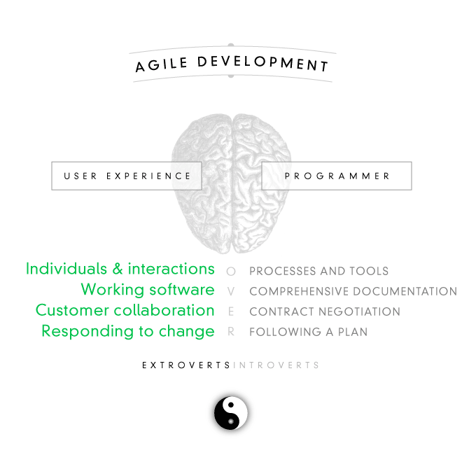
Agile development, explained
Oct. 29, 2010
Nature's pace, the school around us
As I consider how to improve existing designs or objects, I observe the tactics of nature, which fulfills all the elements of design, most especially that of time. The element I struggle with the most, is that of time.
How humans deal with the element of time separates us from all other organisms. Observe this farmer of Snakeroot Organic Farm in Maine. He states “As farmers, we need to adjust our lives to the natural clocks that are out there...to learn that, and make that pace my pace.”
Pace of Life from Scott Julian on Vimeo
Inspiration is difficult for designers who choose to coop themself in square rooms with 90 degree angles. Those who seek to learn from nature will soon discover their very location contradicts most natural environments. In Disney's Meet the Robinsons, Lewis is an inventor. Observe his studio.
Oct. 21, 2010
What must a designer create to subtly convince and persuade the unexpected user? The trick is to find just enough between excess and too little.
This topic touches on why I am so excited about the future of web typography. Letterforms are a blending of persuasive art and raw practicality—form and function on display.
Oct. 20, 2010
“Surfers as a whole have evolved beyond being mesmerized by animations. They want the substance without the hoopla.”
May 20, 2010
Distraction and disorganization kills creatives
In my life's pursuit to make a living through art, I acknowledge two great impediments to any artist's success: Distraction and Disorganization.

Distraction is a lack of focus. It stems from discouragement, which stems from doubt. Artists doubt themselves too much, which is the reason they become discouraged, which leads them to distraction. The correlation between doubt and distraction is discussed by a religious talk given by Elder Kevin W. Pearson of the LDS Church.
Scott Belsky states Creativity x Organization = Impact. It is essentially disorganization that forces an artist into undiscovery, which artists know will make them “poor.” Consider the words of Scott Belsky as he discusses some of the most organized business enterprises in the world. Although they may be large and filty rich, they are not necessarily the most creative—but have a system that makes consumers swipe their credit cards repeatedly.
I believe creativity is the primary spark to a venture. As represented by Wal-Mart or Fed-Ex, the organization that is derived and refined from that venture is the perpetual fuel for monetary income. As in Apple or Google, stoking this flame with creativity makes it a bonfire!
I recall sound advice given to me by Brent Meikle, currently assisting me on a business venture, who said “Think in terms of the business, and no longer of product.” Meikle, an accountant by trade, is surely obsessed with organization. Me, a designer-artist by trade, is obsessed with creativity. Certainly adhering to only one of these theories would be damaging. Therefore, the merging of business (organization) and creativity is key for success.
If an artist desires to make money from the God-given talents they possess, they must embrace organization and stay on task. Carpe Diem!
April 2, 2010
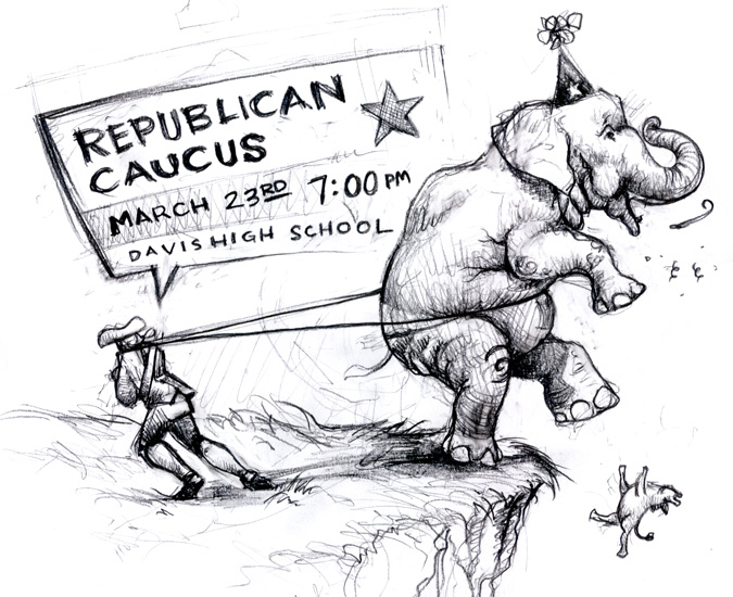
Where have all the pencils gone?
Toss the mouse, grab a pencil
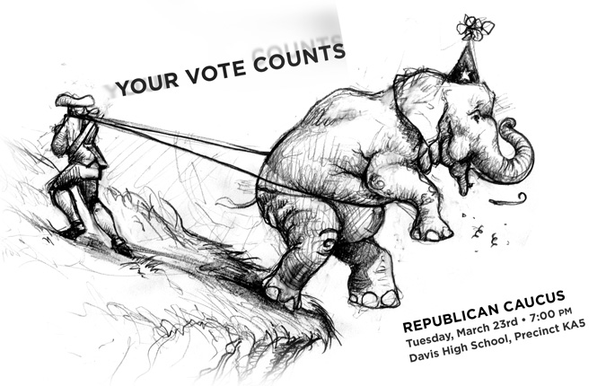
I have a confession to make. I use my laptop so much, I no longer carry pencils or pens. I have difficulty finding pencils around my house, and even my children resort to Crayola markers and melted chocolate chips for kitchen-wall vandalism. In commemoration of this sad truth, I borrowed a pencil and sketched a complete advertisement for a political event, rather than relying on my computer for pristine vectors.
Original Sketch
Surely there are conceptual differences between the two images and statements, but I questioned the strength of pencil type vs. vector type (type of computer origin). Because the flyer would end up on doorsteps, I was concerned the sketched typography appeared too grungey and almost underground. Therefore, I replaced the pencil type with vector type. Is this post hypocritical?
If you happen to think this was an unwise move, let me know why. I always appreciate feedback.
Final Result
Dec. 29, 2009
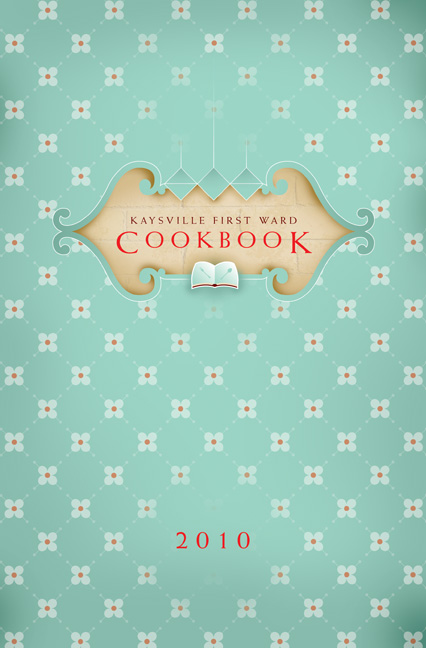
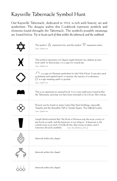
Kaysville 1st Ward Cookbook
Symbolism in everything
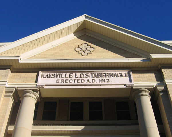
I was asked by my fellow churchgoers to design the ward cookbook, but to not include the stereotypical picture on the cover, which is our meetinghouse, the Kaysville Tabernacle. Surely there were other icons that represented our ward, but I couldn't help ignoring the prominent building that stands as a pillar of recognition within our community.
Therefore, I decided to implement the architectural, artistic and symbolic elements found throughout the structure and include them within the cookbook's design.
I spent one Sunday morning shooting photographs of the beautiful tabernacle, designed by Architect William Allen.
Sadly, the tabernacle has undergone several additions and alterations which have rendered the structure quite functional but somewhat awkward in its visual appearance. Old photos of the building reveal its perfect symmetry, but recent alterations and additions have made the tabernacle unsymmetrical and visually awkward. Some ward members refer to these alterations as “The 70s.”
Over 150 cookbooks were ordered and printed, and since then more have been requested. Contact me if you would like to order a copy for $8.50.


Oct. 18, 2009
Isn't fall glorious?
Zip-A-Dee-Doo-Dah Day
On the way home from church, my son crunched leaves. It reminded me of this song, specifically the eloquent audible transition between James Baskett's “song that jumps right out of your mou—” and “zip-a-dee-doo-dah…” The animation burst that accompanies the transition times it perfectly.
In nature, and far from the computer, designers find great inspiration.
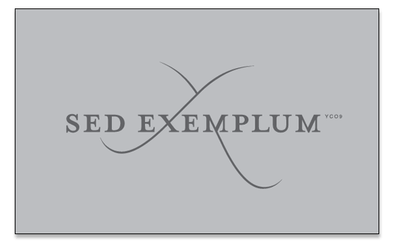
October 14, 2009
Sed Exemplum
Be Thou an Example
I was recently asked to design a t-shirt for youth that relayed the Apostle Paul’s words, “Be thou an example.” I opted to write the phrase in Latin because it reduced the number of characters, had only two words, and has an excellent phoenetic ring to it. It also displays the ∞ symbol, which represents “infinity.”
October 9, 2009
The conscious meld of programmer and designer
Mint made it yummy
The conscious decision of uniting programmers and designers to one great cause gave Mint a great presentation with a powerful plot.
What of their glorious UI and their simplified and fun interface? Mint’s original large text fields and well-designed submission forms made me happy, I actually enjoyed submitting my passwords and usernames to all my financial institutions.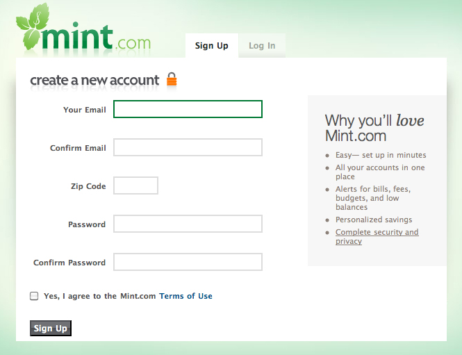
I now struggle with the sad fact that Intuit manages all my passwords and usernames for my financial institutions...It’s like giving my wallet and entire life savings to an obese rich guy on a street teeming with pick-pockets.
Read more about Mint’s acquisition.
Sept. 28, 2009
Tease a techie today, become one tomorrow
It’s what we do
In the 80s, I teased Mac Users. In the late 90s, I began to use a Mac. When texting was new, I teased anyone who texted. Today, I texted two or three people, and wished I could text faster. Last week, I told an avid Twitter user to not confuse action with results, as if Twitter was a complete waste of time. I placed a video on my blog that blasted Twitter users.
This time, while I teased this techie, he tried to convince me otherwise. After the discussion, I concluded that Twitter allows individuals to become stand alone Oprahs, where every product or link they endorse could generate a buzz equivalent to the endorsements of the rich and famous. Twitter is an alternative universe where those who lack popularity in this tangible world can wield great great power in the digital world.
I have now made a mental note that when I get the urge to administer techie-teasing, I best get with the times. See how Twitter can be a powerful marketing tool for businesses.
Sept. 17, 2009
All about the brows
Eyebrows key in facial recognition
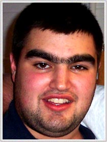
Although I have thick forest-like eyebrows, the man above is not me.
I have drawn caricatures professionally, and learned that eyebrows must be drawn properly to obtain likeness. Check out this fascinating article on the importance of eyebrows in facial recognition.
Aug. 25, 2009
All for one easy payment of...
Remove the hurdles
Is it easy for your bread and butter to arrive? Is there a means it can arrive quicker? Without cost? Better? In a larger amount?
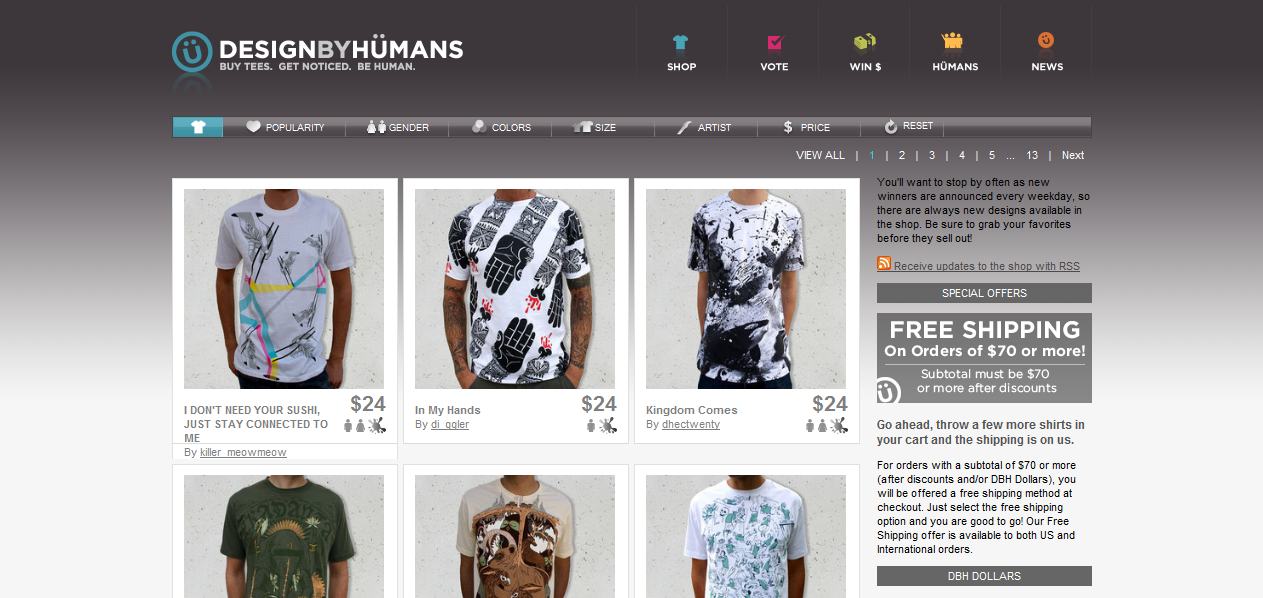
A client sought my assistance in building an online storefront that sold 10 items. The site had little else to offer and its sole purpose was to sell product. He then mentioned he wanted a STORE tab. Simultaneously, we agreed that the STORE tab would be unnecessary if we could place product directly ON the homepage.
As an example, see Design-by-Humans’ past homepage and storefront which display the price and product immediately. The DesignbyHumans site has since changed. Although its design has improved, the consumer cannot pay as quickly, undoubtedly thwarting many.
Wise design suggests we remove the hurdles for payment.
Aug. 24, 2009

The Power of Convenience
And what comes with it
On Saturday, after interviewing a WWII veteran for the Warbliz Project, I confronted dense traffic. My stomach growled so loudly I could hear its tremor over the noise of my rattling Geo Prism. Irritated at the tortoise-like movements on the hot freeway, I took the nearest exit whose blacktop lead to no commercial restaurants. “There has to be a drive-thru around here,” I thought, and my eyes shot upward searching for brightly colored signs. Further to the West, I saw it...the golden arches. Immediately, my mind released taste bud triggers, and McDonald’s Value Menu swarmed my mouth.
As I drove westward, the documentary Super Size Me crossed my mind, but it departed as I allowed the $1 Sundae fantasy flavor to overcome my tongue.
Suddenly, my advertising gullibility alarm started to sound, and I began to question why I was so eager to visit McDonald’s. I generally support local business owners, yet I passed restaurants who lacked franchising dominance—but I was hungry, hot and impatient. I pulled up to the two-lane drive thru, rolled down my window, and placed my $3 order. This was odd. There were no passengers in my vehicle clamoring for fries (which I don't particularly care for), I was on no timeline, and Mexican Food is my mouth's real party...So why did I chose McDonald’s?
Convenience.
In retrospect, I would like to evaluate my state of mind during the decision process: Hot, hungry and impatient. I fit the bill of a consumer who sought convenience as numero uno.
As with most epiphanies, I relate them to my design delivery. Am I convenient enough? Do I have a double path entry leading to my office? Do I advertise more prominently than my competitors?
I don’t—after all, who wants hot, hungry and impatient clientele? I’ll leave that to HP’s Logoworks. Those who choose Logoworks will eventually seek a “better burger.”
Aug. 14, 2009
Excellent audio-visual presentation
The best I’ve seen
Politics aside, Annie Leonard’s “Story of Stuff” is glorious!
Aug. 13, 2009
Logo reality check
I would have never said this in college
Logos do not make businesses, people make businesses. Logos might facilitate in breaking businesses, but people break them faster.
Aug. 12, 2009
Design critiques: a playground of learning
Nosebleeds are good for the soul
In college, critiques were my favorite. At the time, I thought my work was stinkin’ cool. When my professors hinted toward the alternative, I would pridefully rebut, as if they didn’t know “who ruled the monkey-bars.” Then, I became an instructor of Graphic Design, and witnessed students resisting my advice.
I would like to apologize to the following Weber State Professors: Pam Beverly, Scott Betz, Steve Stones, Suzanne Kanatsiz, Kent Ripplinger, Jim Jacobs and Emmanuel Garcia.
July 28, 2009
“Small is the new big. Sustainable is the new growth. Trust is the new competitive advantage.”
Peter Bregman of Harvard Business Publishing writes a fabulous article which touches on the necessity of businesses to adapt to today's economy. Here come the underdogs!
May 30, 2009
Is sIFR the solution?
This is a long “audioless” slideshow for all you web typography geeks who are looking for a solution to the aforementioned problem. Geek Meet: Web Typography and sIFR 3
May 28, 2009
Typographers making dents in the WWW
Arial and Palatino, getting old fast.
Historically, the web has offered web developers a limited typographic palette. To maintain consistency in visual style, designers who cared were required to flatten and export non-web-ready type in bitmap form. I know a designer who has turned completely from web development, because the web type palette is so limited. I know the frustration.
Web Designers behind Comcast.net and CNN.com chose to use “within-the-box” thinking which resulted the inclusion of web fonts within their web identity.
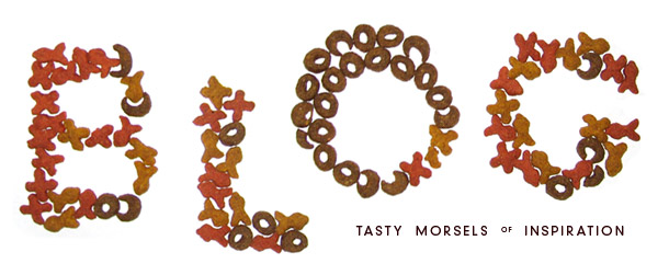
Slowly, the typographer's palette in web development is increasing. FontLab has been hard at work, developing the “.phf” format, touting the statement “Use any font in your own website,” and they have accomplished this feat. Although they're outrageous and raster, they're dynamic and searchable. This technology can convert the beautiful typeface Akzidenz-Grotesk and the cat food typeface above, into dynamic web fonts!
SIL International, has been extremely detail oriented in including all the Latin characters in their Gentium typeface, which is one of my favorite fonts with an OFL (open font license). Gentium can also be loaded within a .css page. View other free open source fonts (.osf) from SIL International.
Similar to what has occurred in the stock photography world, fonts may also become pirated, mimicked, or devalued to the point of insignificance. Imagine the entire world with unencumbered access to Trajan, the ultimate “sucker-font”…What a nightmare!
May 20, 2009
“Entrepreneurship is about reward from your efforts…it is the secret weapon of America”
Greg Warnock, Junto Partners
May 19, 2009
Tangible vs. Virtual
Our hands are soft
Twitter. Blogger. Facebook. YouTube.
Young people, including myself, forget the tangibility of life. In a techie's lust for the next virtual app, few create or experience the tactile object.
I recommend a garden. Dirty fingernails are fun, and whatever happened to dancing?
Buttercrunch Lettuce, tastier than Blogger, born and raised in Kaysville Utah
May 19, 2009
“Over time, advertising's results are best judged by the exposition of the consumer's pocketbook.”
February 3, 2009
Ignoring the product, selling the sale;
The nemesis of great visual communication?
I have been employed by many traditional media businesses in Utah, including newspaper companies, print-shops, advertising agencies, sign-shops and publishing firms. I began in 1996 as a production designer for yearbook creation, and spent several nights centering portraits in rectangular boxes. Since then, I have worked my way to sustain myself through self-employment. I have learned mountains of truth from each past company, and am grateful for their training—but I have also witnessed a shoddy truth about many media businesses: They sell only the sale.
The overarching emphasis of many media businesses is placed on the sale, and not on the form or function of the design product. The exuberance to protect the sale often trumps opportunities to improve the very product being sold.
Three reasons most media outlets do not tap into visual communication excellence are:
1. The backgrounds of the company executives reveal great experience in sales or business, but little or no visual communication experience. The emphasis on the sales or “landing the job” is naturally more important. Any work resulting from the sale is only peripheral, because the goal has been met. Due to the product's “peripheral” status, efforts to improve its quality are routinely bypassed.
2. High-demand, not enough time. Quality work generally takes more time. Poor work generally takes less time. Although a constant sales force is needed for any business, a hypnotic emphasis on obtaining more work through sales and increasing sales staff will undoubtedly swamp those who produce. In such a scenario, creators have little time to tap into greatness.
3. Often, there are many layers of flesh between those who request a job, and those who create the job. Although the quantity of individuals involved can hinder a successful result, it is not necessarily the number of peole that matter. It is the communication amongst the group that occurs at separate times that disallows team collaboration. This results in garbled, indirect or insufficient information.
Steve Jobs once said "People think focus means saying yes to the thing you’ve got to focus on. But that’s not what it means at all. It means saying no to the hundred other good ideas that there are. You have to pick carefully…We just want to make great products.”
If Mr. Jobs quote holds true, the disparate communication that occurs between individuals at separate times allows many to make decisions that oft times hinder those directly involved with product creation. Furthermore, the “yesses” and “nos” mentioned are difficult to track, thus magnifying communication problems and ultimately hindering the product.
Many businesses who sell media get distracted in pursuits not related to the very product they sell. This distraction can create an imbalance, which inevitably hinders the success of the product being sold.
How this stumbling block can be removed:
1. More entrepreneurs with a strong Visual Communication background are needed.
2. Greater ratios of designers to sales staff frees more hours to fulfill the demands of quality.
3. Collaboration between all involved in the project, fosters success. Not only is the designer enlightened about the client's interests, needs and direction, but the client is educated and inspired by all members of the team.
There is too much graphic design, and not enough visual and verbal communication. Design that truly makes a difference for the client is key. Many media outlets who produce continual work are often distracted in other realms. Strict focus on the well-being of the product will ultimately achieve success. By and by, heads will turn and people will align themselves with quality.
February 1, 2009
“Graphic Designers” or “Visual Communicators?”
The role of a “Graphic Designer” implies one who designs graphics, whereas the role of a “Visual Communicator” implies one who communicates visually.
Whom wields more communicative power?